Elev8 Care Ltd (2025)
Overview
Elev8 Care Ltd is a care company focused on helping individuals improve their quality of life through compassion, support, and empowerment. The name “Elev8” represents both the idea of elevation and the number 8, which symbolizes continuity and balance.
The goal of this project was to design a logo that visually communicates the brand’s uplifting and caring nature, while keeping the identity modern, simple, and memorable.
Concept
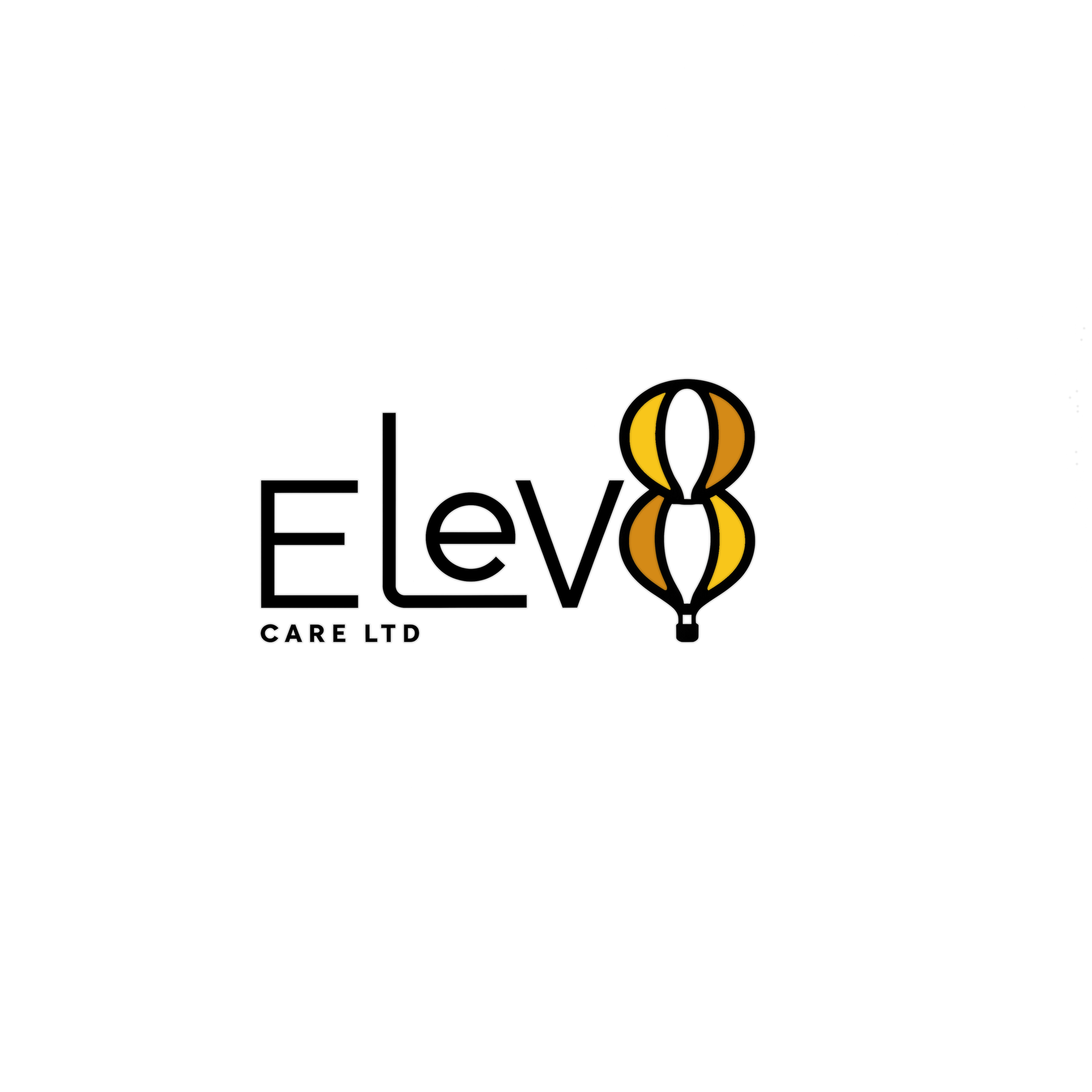
The logo combines clean typography with a symbolic design element that brings meaning to the name. The word Elev8 is styled in a geometric, modern typeface, while the “8” has been creatively transformed into a hot air balloon.
This symbolizes upliftment, care, and guidance, aligning perfectly with the company’s mission to help people rise above challenges and live fuller, more independent lives. The result is a logo that feels approachable yet professional, reflecting both the warmth of care and the strength of growth.
Typography
A custom geometric sans-serif type treatment that feels clean and open, representing trust and professionalism.
Symbolism
The “8” doubles as a hot air balloon, a visual metaphor for lifting others up.
Colour Palette
Warm tones of gold and amber bring energy, optimism, and positivity, while black adds balance and clarity.
Layout
A horizontal composition that keeps the logo readable and versatile across digital and print formats.
Goal
To design a logo that captures the uplifting and supportive spirit of Elev8 Care Ltd, balancing professionalism with a sense of warmth and humanity.
Outcome
The final design feels confident and meaningful, a modern identity that stands out in the healthcare sector while clearly reflecting the brand’s core message: to elevate care and empower lives.